And People Impaired in Other Ways
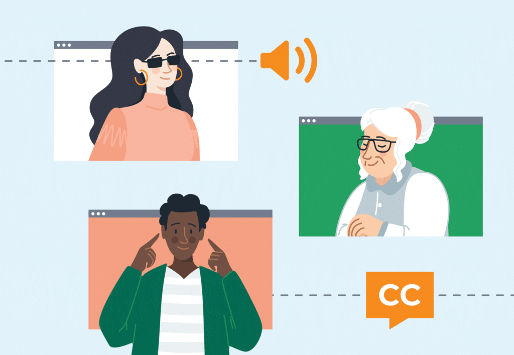
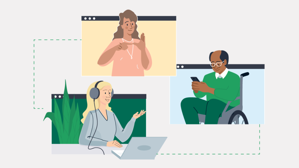
Back in March our product team began auditing the HotDoc app to see how we could improve accessibility for people with visual impairments as well as people impaired in other ways, such as auditorily, cognitively, neurologically, physically and through speech.
Maribell Reyes, a HotDoc User-Experience Designer, says, “In following our mission to improve the health care experience for everyone in Australia, we’ve been working hard to ensure that booking an appointment on HotDoc is as easy and seamless as possible whether you have a disability or not.”
“One in five Australians have a disability and we want to make sure HotDoc is catering for them just as much as other Australians.”
Nate Watson, a HotDoc Front-End Developer, and one of the early initiators of the project says, “While the changes so far seem small, I think they will have an enormous impact on users with impairments. After all, we’re talking about healthcare where improving ease-of-access can have a really meaningful impact.”
Solve for one, extend to many
When approaching the challenge our product team leaned heavily on a well-known principle in design referred to as ‘solve for one, extend to many’. The idea is that trying to design for everyone is far too daunting of a task, whereas focusing on designing things for those people with permanent disabilities means we can create solutions that benefit everyone.
An example (shown below) is designing for someone who is blind. By ensuring the HotDoc app is user-friendly for someone who is blind, we can guarantee that the app is also user-friendly for someone who is partially visually impaired (eg. someone with cataracts) as well as someone who is visually impaired in specific situations (eg. a distracted commuter).
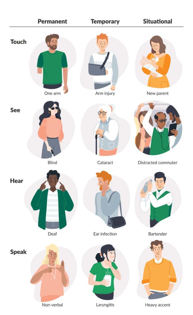
With this in mind our product team started to look at how they could improve the HotDoc app for those who are: blind, deaf, non-verbal and permanently physically disabled.
Early stage changes
Nate Watson, Front-End Developer, says, “We started the process by focusing on critical portions of the app. We combined automated tools with manual testing, such as using screen-readers, to uncover anything that might be acting as a barrier for users.”
After completing a preliminary audit of the HotDoc app the product team got to work making changes to the interface. While these changes aren’t obviously apparent when looking at the app, the subtle modifications make an enormous difference to those with impairments.
Here are a few examples:
i) Improved image name descriptions
We’ve improved the names of images in the HotDoc app (eg. doctor profile photos) so someone who can’t see and is dependent on a screen-reader understands when an image is being described and what the image is about. For instance, a photo of a doctor that may once have been read aloud as “photo_1762” is now read aloud as “Dr Thompson’s profile picture”.
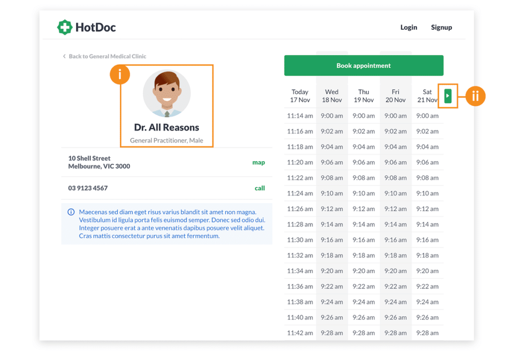
ii) Added accessible names to buttons
Similar to the above we’ve improved the descriptions of icons such as the ‘next’ button in a doctor’s calendar so someone using a screen-reader can properly understand the call-to-action. For instance, a screen-reader previously read aloud “button” when it came to the next button in a doctor’s calendar, providing no indication of what the button was actually for. Now a screen-reader says “later days”. This makes it much clearer to those with visual impairments that by pushing the button they will see later days in a doctor’s calendar.
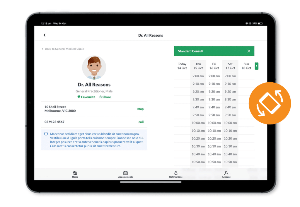
iii) Landscape view integrated on tablet devices
We’ve also adapted the HotDoc app to be able to display in landscape view as well as portrait view on tablet devices. This has made it much easier for people with limited strength or dexterity to hold a tablet device and use the HotDoc app. It also means a user can make use of a tablet stand that is fixed in a landscape position.
How our scores have improved
Back in March when we first benchmarked our web accessibility, we were achieving an average score of 54.4% on audits performed by Google’s Lighthouse tool. In just 7 months we have increased this score to 70.2%. On our doctor calendar pages our score has improved by 40%—these pages now score 89% in Lighthouse’s automated audits
Nate says, “We’ve still got lots more work to do, but it’s really great that we’ve already been able to weave meaningful improvements into what we build.”
Next steps
The next big step for our product team is to get an external party to do a professional audit of the HotDoc app so we can dive into much greater detail and flag further areas of improvement.
Maribell says, “We also want to look at how we can improve accessibility for our other products such as New Patient Registration Forms, Reminders and Recalls.”
We’ll keep you posted on developments.

